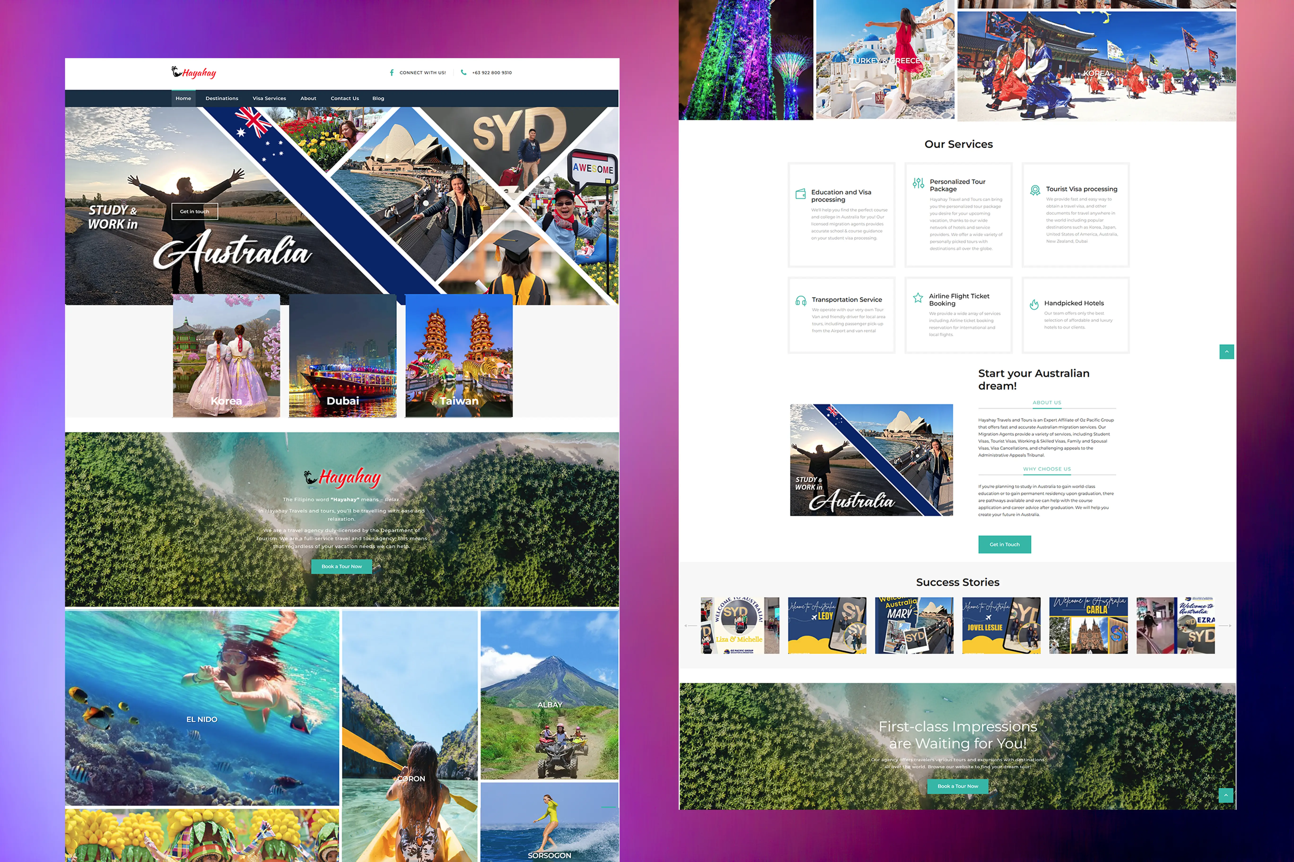
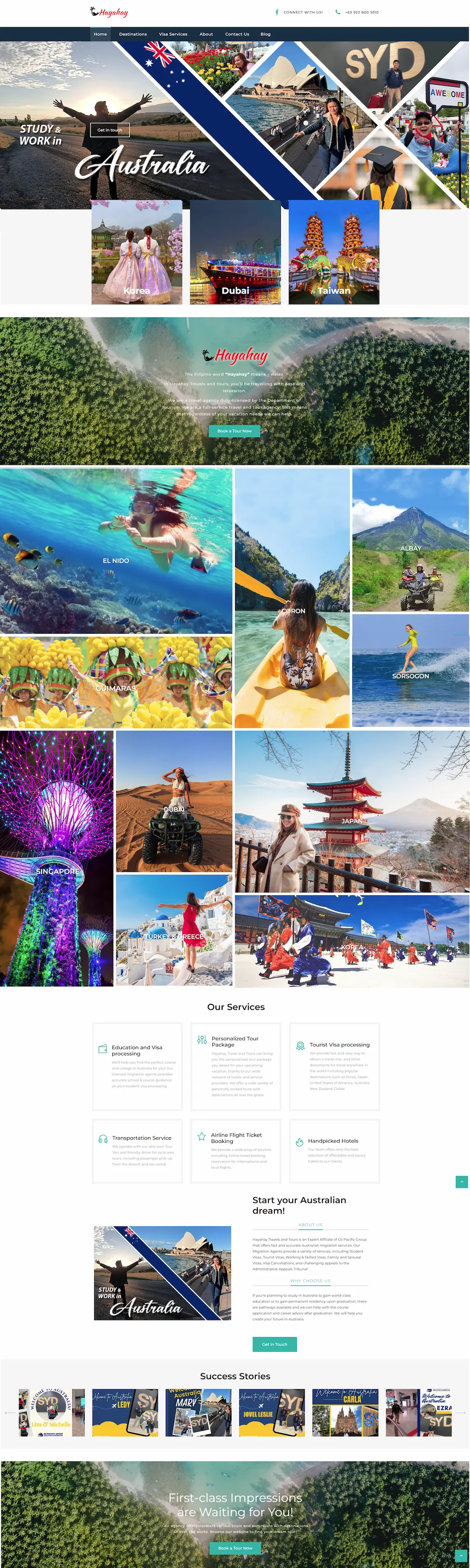
Designing for the Traveler on the Move
Most travelers aren't booking tours from a 27-inch screens—they're doing it from a phone while waiting at an airport or sitting in a café. I prioritised a Mobile-First architecture to ensure that Hayahay's complex services didn't feel cramped. The site is designed to be just as intuitive on a 5-inch screen as it is on a desktop. I also added subtle animations to make the experience feel more dynamic without overwhelming users. The goal was to create a digital space that felt as welcoming and efficient as the in-person service Hayahay Travels is known for.
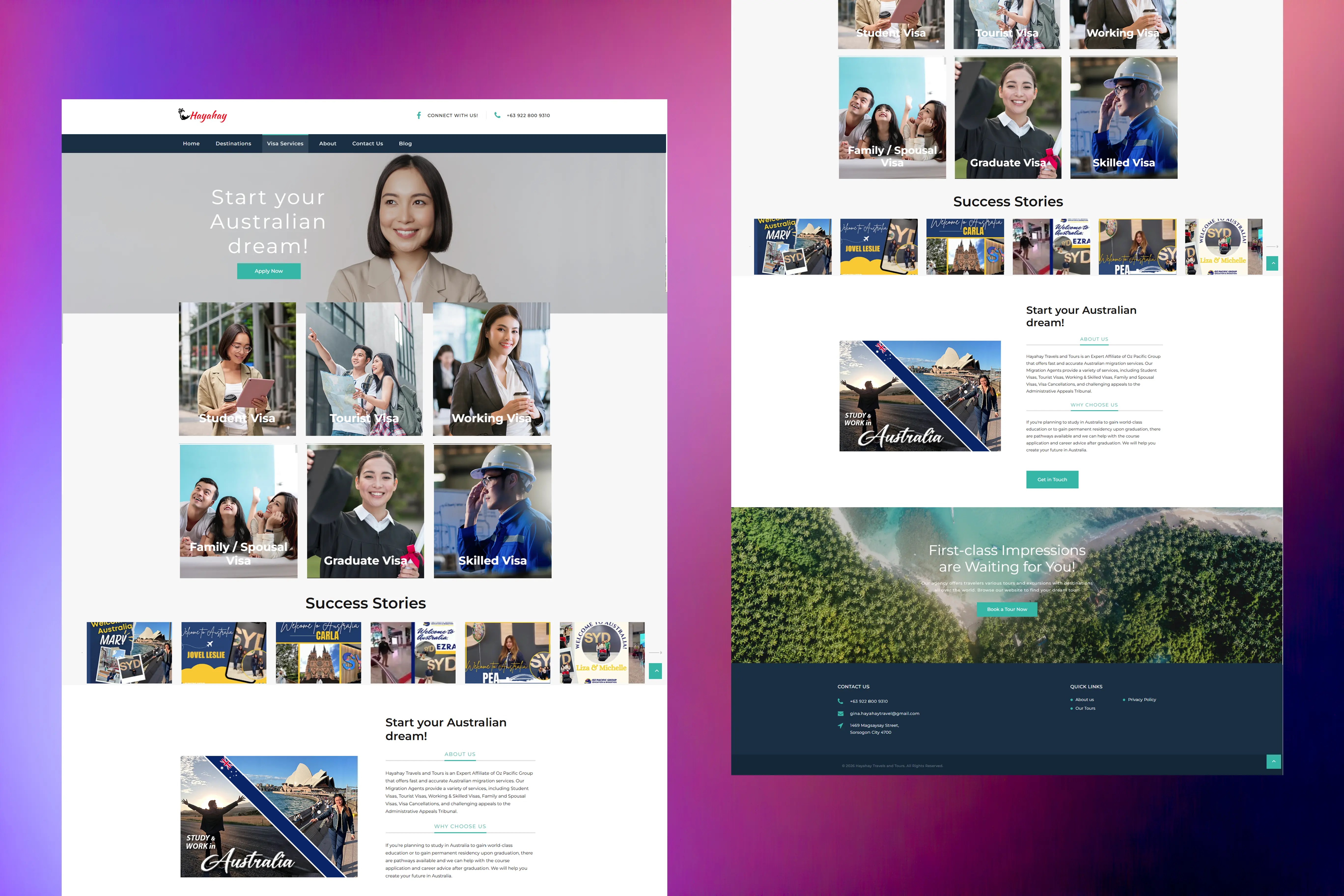
From a Business Analysis perspective, mobile conversion was our biggest KPI. I designed the mobile UI to be thumb-friendly and fast. While desktop users get smooth GSAP hover effects. This means the 'Window View' activates automatically as the user scrolls, creating a 'living' portfolio that demonstrates its value without requiring a single tap.